
qPCR数据处理指北
PlateEditor 与 qPCR 数据标准化处理流程
views
| comments
qPCR 数据处理流程,涵盖原始数据的孔板编辑、信息整理,以及利用 Excel 实现自动化分析与结果可视化。
一、孔板数据编辑与格式转换#
PlateEditor ↗ 是一个用于编辑和管理 PCR 实验孔板数据的在线工具,支持 Bio-Rad 和 Roche 仪器数据的导入与可视化编辑。具体的操作步骤如下:
1. 导入原始数据#
-
Bio-Rad仪器导出方式:
-
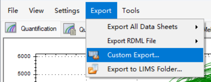
在 CFX Manager 软件中选择
Export→Custom Export→Export -
保存为
.xlsx或.xls格式 -
在 PlateEditor ↗ 的右侧 “Data Import” 区域上传该文件
-
-
Roche 仪器(LightCycler)导出方式:
- 导出
.txt文本文件 - 全选内容并复制粘贴至 Excel 表格
- 另存为
.xlsx文件后上传至 PlateEditor ↗
- 导出
2. 孔板编辑与标注#
在 PlateEditor ↗ 中可对每个孔进行样本名(Sample Name)和目标基因(Target Gene)的批量标注:
- 选择孔位:
- 单孔点击即可
- 点击行标签(A–P)选择整行
- 点击列标签(1–24)选择整列
- 按住鼠标左键拖拽选择矩形区域
- 输入信息: 在右侧面板填写:
Sample Name:如 WT_Control、KO_Treatment 等Target Gene:如 GAPDH, ACTB, IL-6 等
- 应用设置: 点击 “Apply” 按钮,所选孔位即被赋予对应标签
3. 数据清理#
若需重置部分或全部数据,可使用以下功能:
- Clear Selection:取消当前选区
- Clear Sample:清除选中孔的样本名称
- Clear Gene:清除选中孔的目标基因
- Clear Values:清除选中孔的所有定量数据(CT 值等)
- Reset All Data:恢复整个孔板为空状态
4. 导出标准化数据#
完成编辑后,在 “Data Export” 区域点击 “Export” 按钮,系统将自动生成并下载两个文件:
- Excel 文件(.xlsx):包含原始 CT 值、样本名、基因名及统计摘要
- PNG 图片:孔板布局图,可用于报告或论文配图
二、数据分析#
- 打开导出的 Excel 数据文件
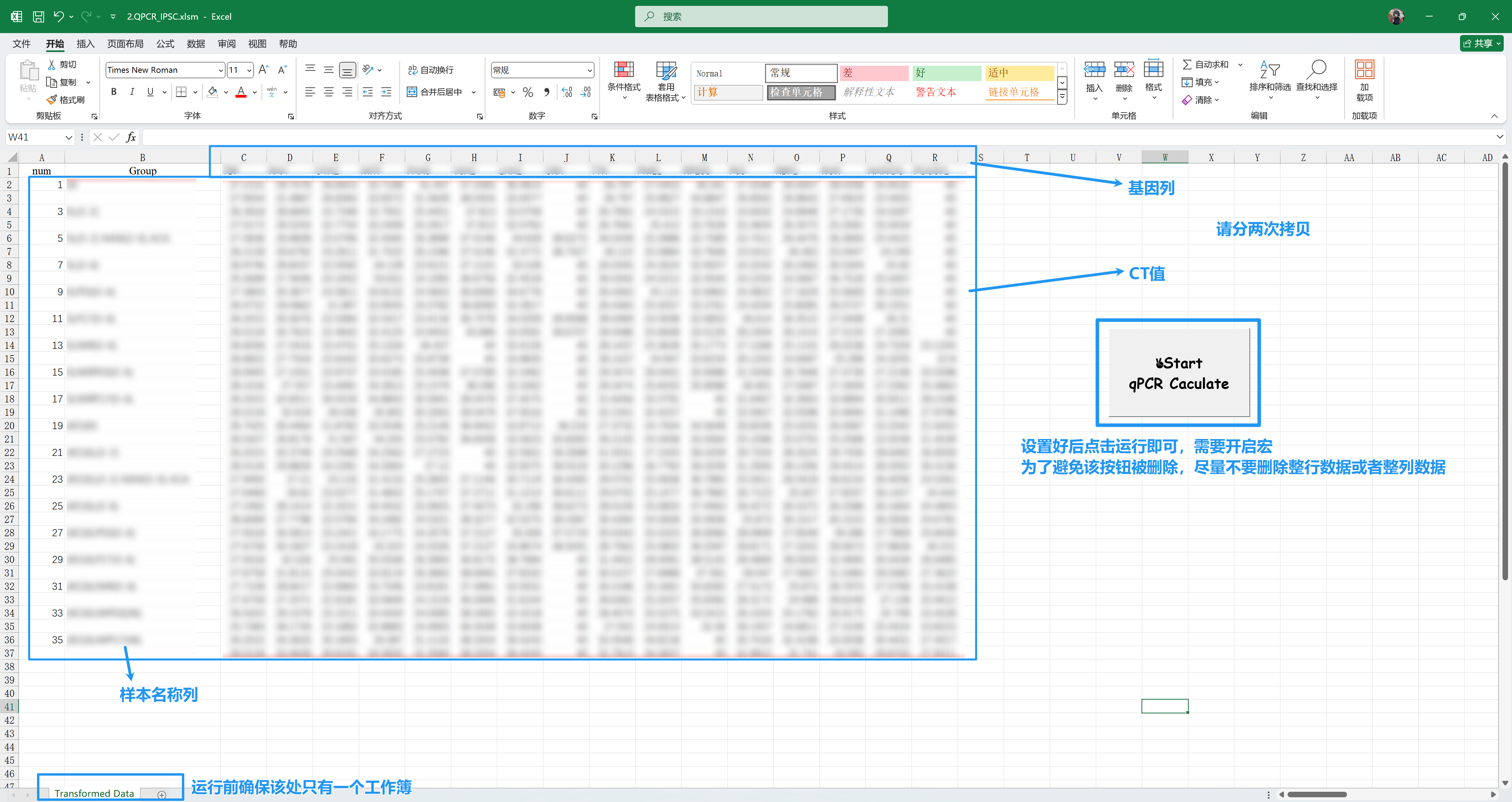
- 将内参基因(如 TBP, GAPDH, ACTB)所在列移动至所有目标基因前列
- 复制以下关键列数据到 2.QPCR_template.xlsm ↗ 中,随后点击按钮即可分析并生成结果
- Sample Name(样本名称)
- Target Gene(目标基因)
- CT 值
- 使用前请确保仅打开此一个 Excel 工作簿(避免宏运行冲突);文件为
.xlsm格式,启用宏后方可执行分析 - 程序将自动执行:
- ΔΔCt 计算
- 相对表达量(2^(-ΔΔCt))转换
- 组间均值与标准差统计
- 生成柱状图(Bar Plot)与数值表格
- 结果输出在同一工作簿的不同 sheet 中,可直接复制图表用于汇报
三、可能有用的脚本#
1. barplot#
library(ggplot2)
library(readxl)
library(tidyr)
library(dplyr)

data <- read_excel("data.xlsx")
gene_list <- unique(data$Gene)

for (g in gene_list) {
  sub_sum <- data %>% filter(Gene == g)
  rep_dat <- sub_sum %>%
    select(Group_Name, Repeat1:Repeat2) %>%
    pivot_longer(cols = starts_with("repeat"),
                 names_to = "rep_id",
                 values_to = "value")

  y_max <- pretty(max(sub_sum$Average + sub_sum$Stdev))[length(pretty(max(sub_sum$Average + sub_sum$Stdev)))]

  p <- ggplot(sub_sum) +
    geom_col(aes(x = Group_Name, y = Average),
             fill = "#6A89C5", alpha = 1, width = 0.7,
             linewidth = 0.3, color = "black") +

    geom_linerange(aes(x = Group_Name,
                       ymin = Average,
                       ymax = Average + Stdev),
                   colour = "black",
                   linewidth = 0.4) +

    geom_errorbar(aes(x = Group_Name,
                      ymin = Average + Stdev,
                      ymax = Average + Stdev),
                  width = 0.2,
                  colour = "black",
                  linewidth = 0.6) +

    geom_point(data = rep_dat,
               aes(x = Group_Name, y = value),
               shape = 21, size = 1.5, colour = "black", fill = "#6A89C5",
               position = position_jitterdodge(dodge.width = 0.7,
                                               jitter.width = 0.25,
                                               seed = 123)) +

    ggtitle(bquote(bolditalic(.(g)))) +

    xlab(NULL) +
    ylab(expression("Normalized to "*italic(TBP))) +

    scale_y_continuous(expand = c(0, 0),
                       limits = c(0, y_max),
                       breaks = seq(0, y_max, length.out = 5)) +
    theme_classic() +
    theme(
      plot.title = element_text(hjust = 0.5, size = 14),
      axis.title.y = element_text(size = 12, face = "plain"),
      axis.title.x = element_text(size = 12, face = "plain"),
      axis.text.y = element_text(face = "plain"),
      axis.text.x = element_text(face = "plain",
                                 angle = 45,
                                 hjust = 1,
                                 vjust = 1)
    )

  ggsave(filename = paste0(g, ".png"),
         plot = p,
         width = 8,
         height = 6,
         dpi = 900,
         units = "in")
}2. heatmap#
library(ggplot2)
library(dplyr)
library(readxl)

data <- read_excel("data.xlsx")
data$Group_Name <- factor(data$Group_Name, levels = unique(data$Group_Name))
data$Gene      <- factor(data$Gene,      levels = unique(data$Gene))

data_norm <- data %>%
  group_by(Gene) %>%
  mutate(
    Normalized_Value = (Average - min(Average)) /
                       (max(Average) - min(Average)),
    label_text = sprintf("%.1f", Average)
  ) %>%
  ungroup()

p <- ggplot(data_norm, aes(x = Group_Name, y = Gene, fill = Normalized_Value)) +
  geom_tile(color = "white", linewidth = 0.5) +
  geom_text(
    aes(label = label_text),
    color = "#7b7c7a",
    fontface = "bold",
    size = 2.7,
    family = "sans"
  ) +

  scale_fill_gradientn(
    name = "Normalized\nExpression",
    colors = c("#f0f8ff", "#c6dbef", "#9ecae1", "#6baed6", "#3182bd", "#08519c"),
    limits = c(0, 1),

    guide = guide_colorbar(
      title.position = "left",
      title.hjust    = 1,
      title.vjust    = 0.5,
      barwidth       = unit(0.5, "lines"),
      barheight      = unit(15, "lines"),

      title.theme = element_text(
        angle  = 90,
        size   = 11,
        face   = "plain",
        hjust  = 0.5
      )
    )
  ) +

  scale_x_discrete(expand = c(0, 0)) +
  scale_y_discrete(expand = c(0, 0)) +

  theme_gray() +

  labs(
    title = "Min-Max Normalized Gene Expression Across Group_Names",
    x     = NULL,
    y     = NULL
  ) +

  theme(
    plot.title      = element_text(hjust = 0.5, size = 16, face = "bold"),
    axis.text.x     = element_text(angle = 45, hjust = 1, vjust = 1, size = 9, color = "black"),
    axis.text.y     = element_text(size = 10, color = "black", face = "italic"),
    panel.grid      = element_blank(),
    axis.ticks      = element_blank(),
    legend.position = "right",
    legend.title.align = 1,
    legend.margin   = margin(l = 5, r = 10),
    legend.title    = element_text(margin = margin(r = 5))
  ) +

  coord_fixed(ratio = 1)

ggsave("heatmap.pdf",
       plot = p,
       width  = 16,
       height = 9.5,
       limitsize = FALSE,
       device = "pdf",
       dpi = 400
)#!/usr/bin/env Rscript
library(ggplot2)
library(dplyr)
library(tidyr)
library(readxl)
data <- read_excel("data.xlsx")
control_group <- "E6"
data_logfc <- data %>%
group_by(Gene) %>%
mutate(
ctrl = Average[Group_Name == control_group],
log2FC = log2(Average / ctrl),
label_text = sprintf("%.1f", Average)
) %>%
ungroup() %>%
filter(Group_Name != control_group)
data_norm <- data_logfc %>%
group_by(Gene) %>%
mutate(
z_log2FC = scale(log2FC)[,1]
) %>%
ungroup()
data_norm$Group_Name <- factor(data_norm$Group_Name, levels = unique(data_norm$Group_Name))
data_norm$Gene <- factor(data_norm$Gene, levels = unique(data_norm$Gene))
z_range <- max(abs(data_norm$z_log2FC), na.rm = TRUE)
p <- ggplot(data_norm, aes(x = Group_Name, y = Gene, fill = z_log2FC)) +
geom_tile(color = "white", linewidth = 0.5) +
geom_text(
aes(label = label_text),
color = "grey30",
fontface = "bold",
size = 2.7,
family = "sans"
) +
scale_fill_gradient2(
name = "Z-score\n(log2FC)",
low = "#2166ac",
mid = "#f7f7f7",
high = "#b2182b",
midpoint = 0,
limits = c(-z_range, z_range),
breaks = seq(-ceiling(z_range), ceiling(z_range), by = 1),
oob = scales::squish,
guide = guide_colorbar(
title.position = "left",
title.hjust = 1,
title.vjust = 0.5,
barwidth = unit(0.5, "lines"),
barheight = unit(15, "lines"),
title.theme = element_text(
angle = 90,
size = 11,
hjust = 0.5,
vjust = 0.5
)
)
) +
scale_x_discrete(expand = c(0, 0)) +
scale_y_discrete(expand = c(0, 0)) +
labs(
title = paste("Row-normalized log2FC (Z-score) vs", control_group,
"\nNumbers: raw average expression level"),
x = NULL, y = NULL
) +
theme_minimal(base_size = 13) +
theme(
plot.title = element_text(hjust = 0.5, face = "bold", size = 15),
axis.text.x = element_text(angle = 45, hjust = 1, vjust = 1, size = 9),
axis.text.y = element_text(size = 9.5, face = "italic"),
panel.grid = element_blank(),
axis.ticks = element_blank(),
legend.position = "right",
legend.text = element_text(size = 10),
legend.key.height = unit(1.8, "cm"),
legend.margin = margin(l = 10)
) +
coord_fixed(ratio = 1)
ggsave("heatmap_FC.pdf",
plot = p,
width = 15.5,
height = 9.5,
limitsize = FALSE,
dpi = 400)
cat("complete!\n")Over~